Dinesh Kumar
UX Writer/Visual Designer
loop
UX / UI DESIGN
UX / UI DESIGN
Loop is an app designed to connect users with their closest friends through past memories and things they love to do together. It allows users to see when they last contacted their friend, and browse a feed for all their mutual interest in order to start conversations regardless of everyone’s busy schedule.
PROJECT TYPE
ACADEMIC APR-MAY 2019
TIMELINE
8 WEEKS
MY ROLE
UX RESEARCHER, DESIGN STRATEGY, UX/UI DESIGNER
TOOLS
FIGMA, INVISION, ILLUSTRATOR, PHOTOSHOP
DISCOVERY OF PROBLEM SPACE
A personal struggle as inspiration
Friendship matters. But staying connected with our friends is becoming harder as we get older. We focus more on our own careers and starting a family, and it’s easy to forget to connect with the most important people in our lives. For this project, I wanted to explore this topic because it is something I struggle with personally. I wanted to create a platform that focuses on cultivating our closest friendships rather than a large network, which social media currently promotes.
SECONDARY RESEARCH
What are the challenges people face today?
Today, technology plays an important part in shaping our interactions and has redefined what friendship means. Through my research, here are some of the challenges people face today:
- People are developing larger social networks online, but ending up with weaker personal connections
- There is an “epidemic of loneliness”. Previously thought as an elderly issue, reports have indicated millennials are struggling
- The rise of technology means people are more connected to work: they have busier schedules and more demanding careers
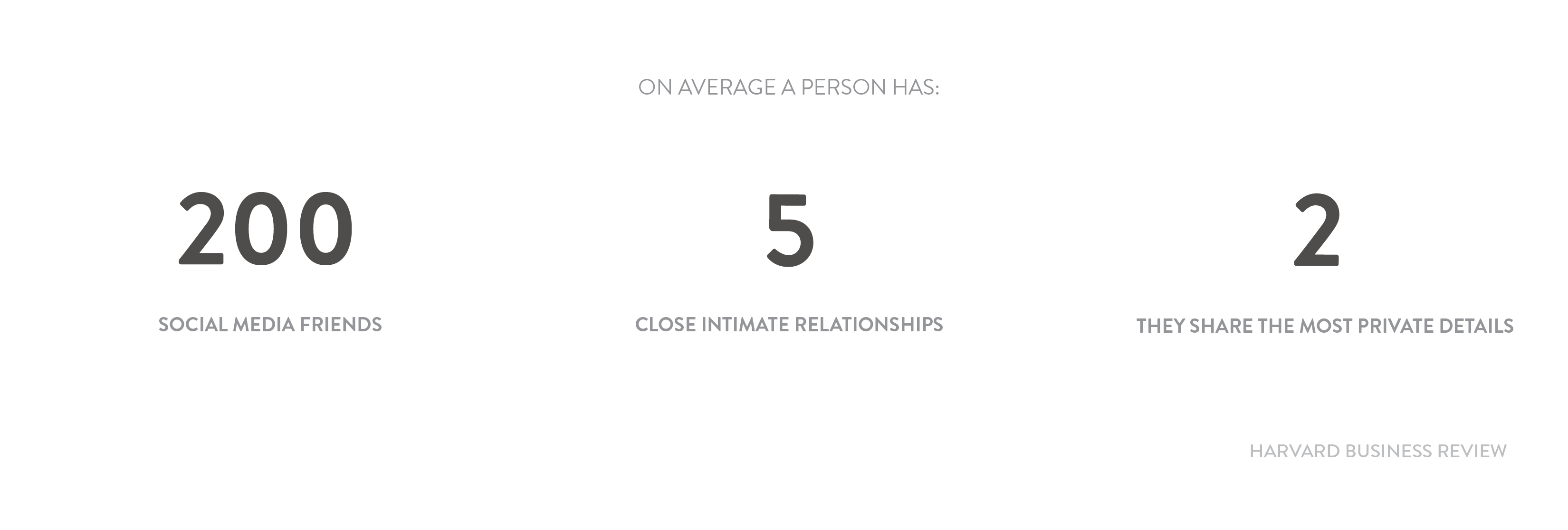
On the surface its seems like we have a lot of friends. But in terms of close friendships (those whom we share personal worries and whom we might call on for advice) there is only 5. This is where I want to focus my project, and how I can help to improve these relationships.
USER INTERVIEW INSIGHTS
Conversation with my users to gather common goals and frustrations
To learn more about the common behaviours and motivations of my users, I talked to 5 millennials who are currently focused on their careers. Here are their shared insights and frustrations divided into themes:

Reminders
With busy schedules, reminders are needed to reach out to a friend. Millennials are more likely to connect with a friend if they are reminded, whether that is through someone posting on social media, or seeing a past photo.

Mutual Interest
They try to stay connected by doing activities they enjoy with their friends. Face-to-face interaction is most important, but connecting through messages with things they are interested in is a good way to bridge the gap when time is limited.

Time and Energy
Millennials are focused on their careers. They will make the effort to look for activities to do with their friends when they have enough time and energy.

Awkwardness
The longer they go without talking to their friends the harder it is to reconnect without an icebreaker.
“I need to remember to talk to my friends and bridge that silent gap by doing more activites together.”
“I like to spend quality time with friends by doing a mutual activity we are both interested in”
PERSONA & EXPERIENCE MAP
Keeping the user and their experience at the center of my design moving forward
From the interview insights, I was able to get a better sense of the millennial experience. With this research, I crafted a persona and experience map in order to drive my designs for the target users and identify opportunties in which to focus my digital solution.
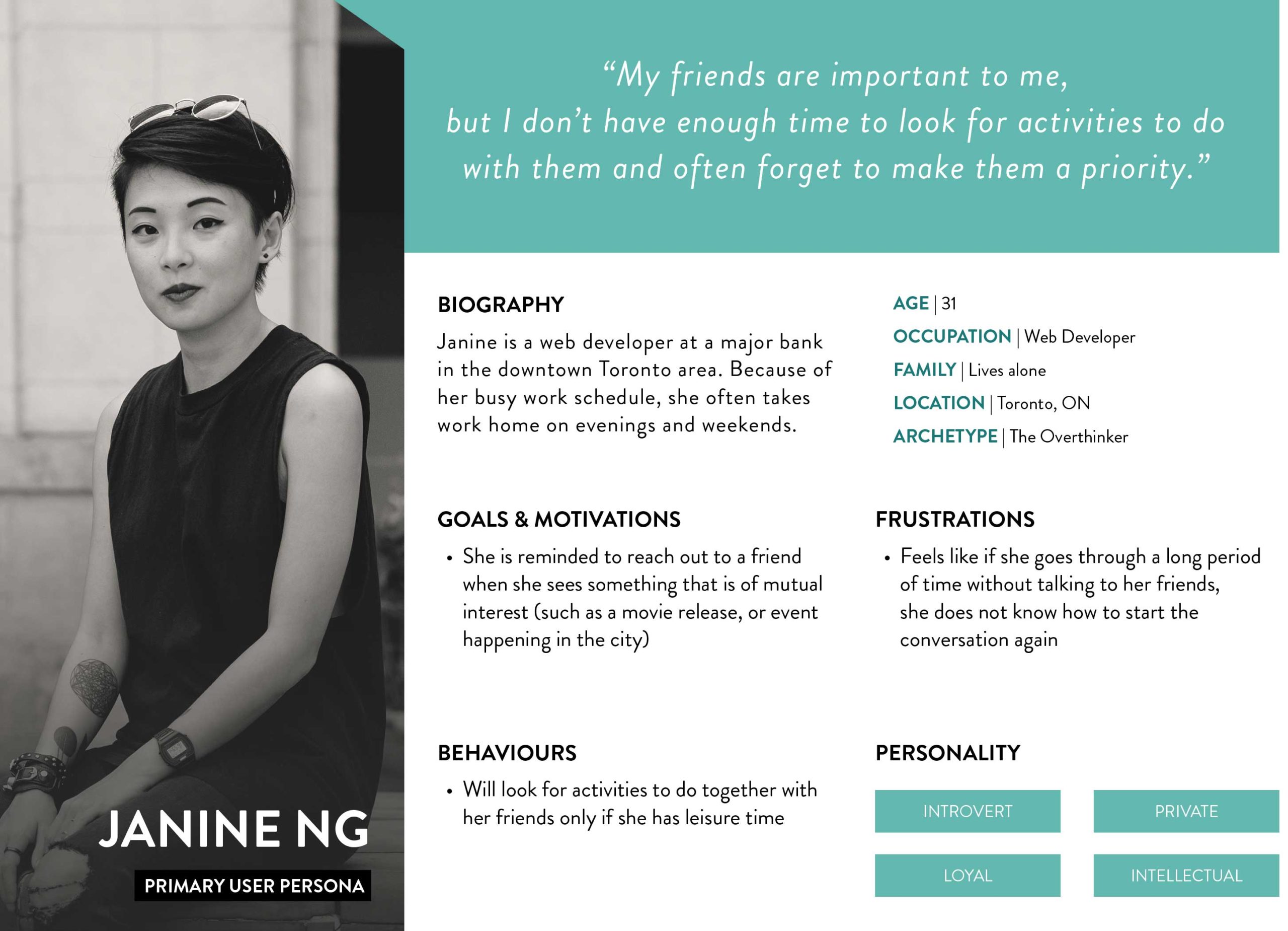
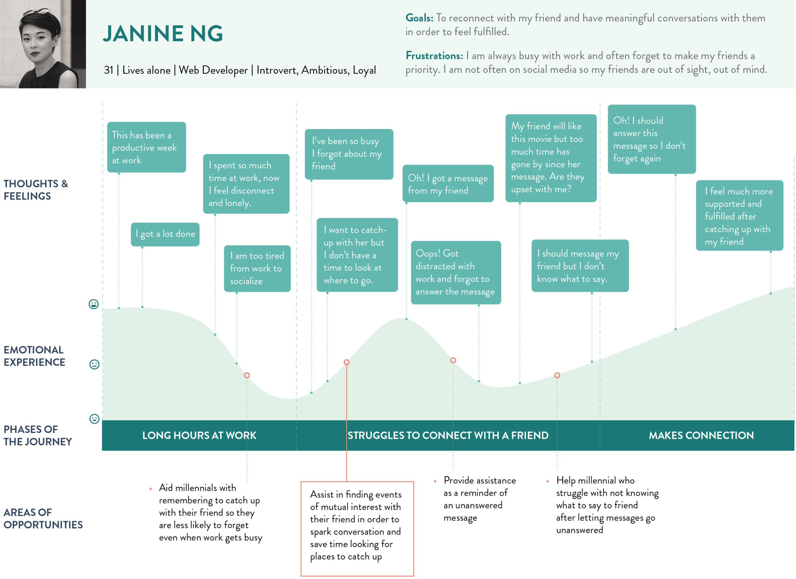
After looking at the experience map and persona, it is clear that millennials want meaningful face-to-face interaction. Rather than thinking about how I can create a meaningful connection, I shifted focus to how I can help millennials spark conversations which can lead to in-person interaction.
With this thought, I refined my project question:
How might we help millennials (ages 25–38) ease the process of reconnecting with their friends through mutual interest in order to lead to a more meaningful relationship?
TASK SELECTION
Focusing on shared interest between friends as MVP
Using the refined HMW statement and considering the needs of Janine the persona, I created a set of 30 user stories under 3 epics in order to help me define the function of my product. Taking into consideration the core value proposition, I chose the following epic and user stories to create my minimum viable product (MVP).
Core Value Proposition
To facilitate the connection of a friend through things we have in common
Core Epic
Connect with my friend through mutual interest
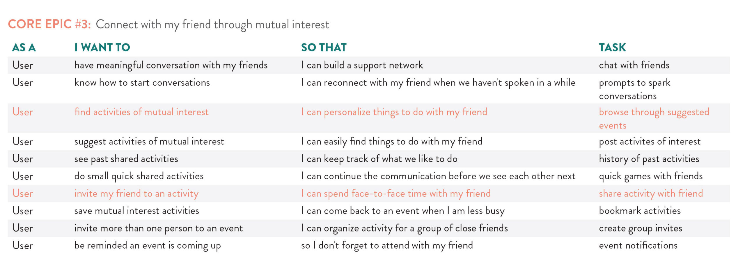
A chart showing 10 user stories under this epic. I defined the task for each story in order to select which primary task flow I would design. The highligted ones are the main tasks I chose to move forward.
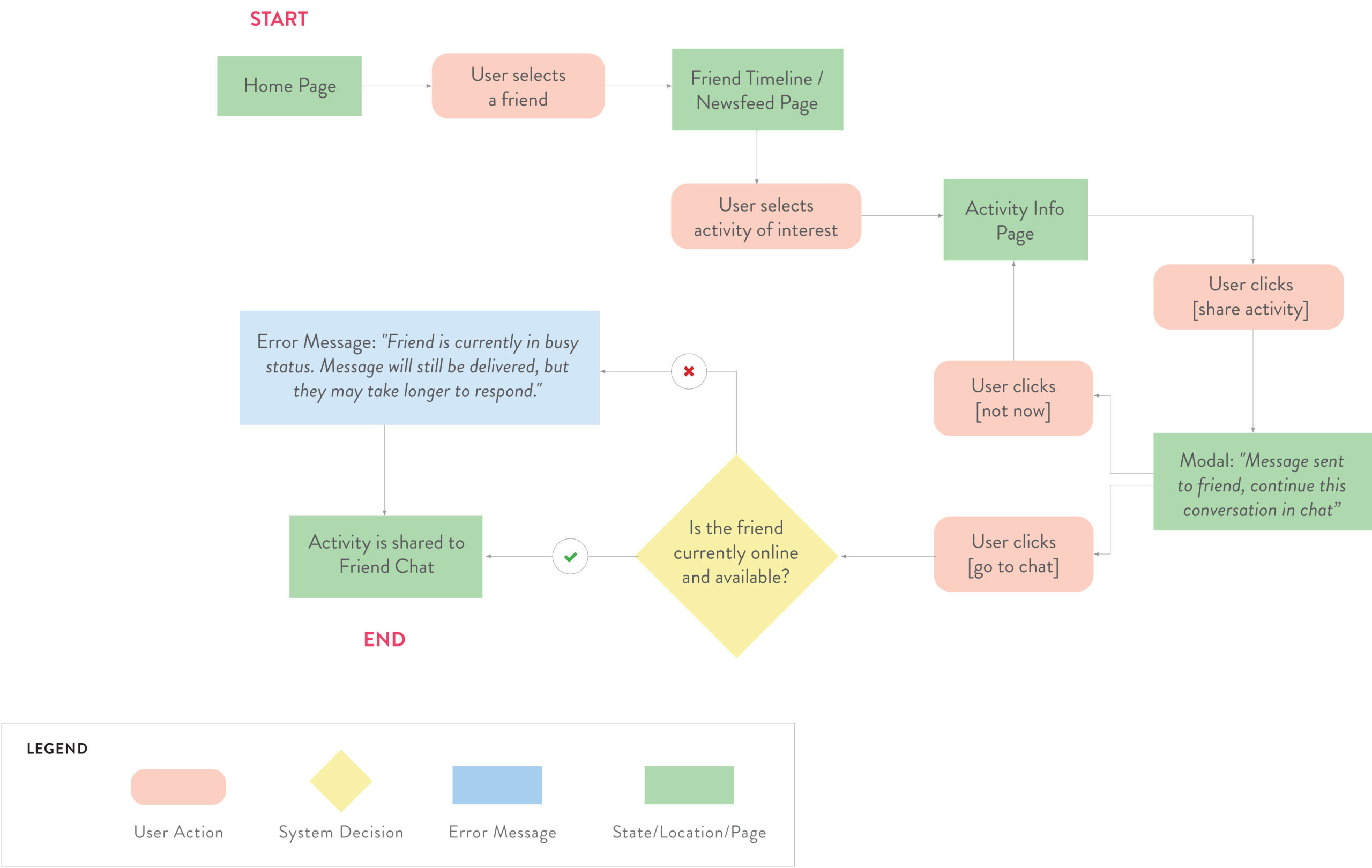
After identifying my main tasks, I developed a task flow thinking about how a user would interact with the product to complete these tasks.
This task flow below shows a user looking for an activity to connect with their friend and inviting this friend to this activity.
SKETCHING & WIREFRAMES
Taking inspiration and explore layouts using pen and paper
Once I was clear on the main task flow, I took to paper and pen to sketch out the possible solution. Using inspirations from other existing UI components and looking at functionalities from apps like Facebook, Cocoon, and Instagram Threads, I started sketching out different ideas.
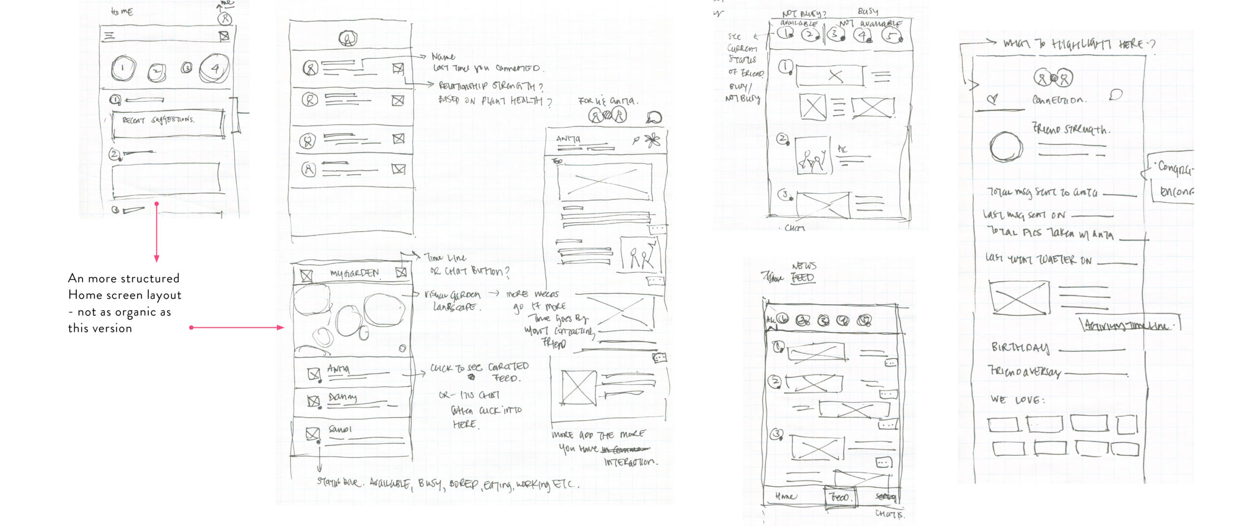
Example of rapid sketching to ideate for the first prototype
From sketching on paper to digital wireframes, I went through different versions of each screen to arrive at the first prototype. This is an example of screen evolution for the feed.
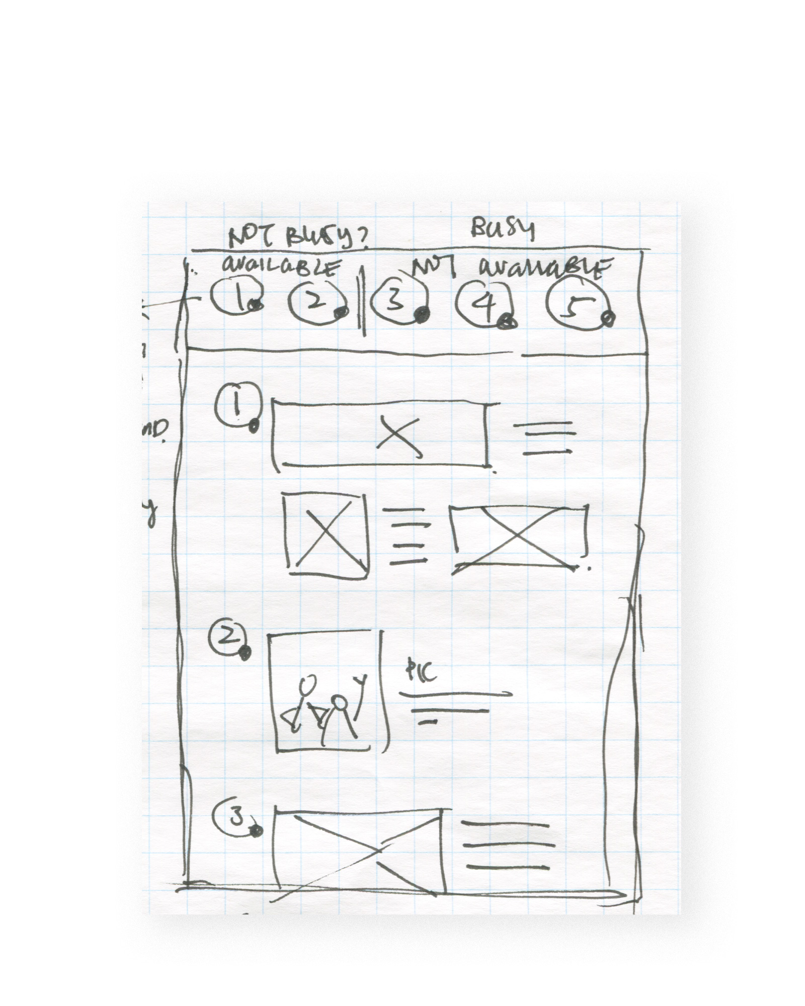
Version 1: This version shows user’s friends on the top navigation. All friend’s interests are listed on a single feed
Version 2: Building off of V1, I added buttons to easily be able to share stories between friends
Version 3: In an attempt to simplify the page, perhaps the feed connects just two people and not all the friends together
Version 4: A digital version of V3, showing a feed where the app can suggest stories and user can add to it
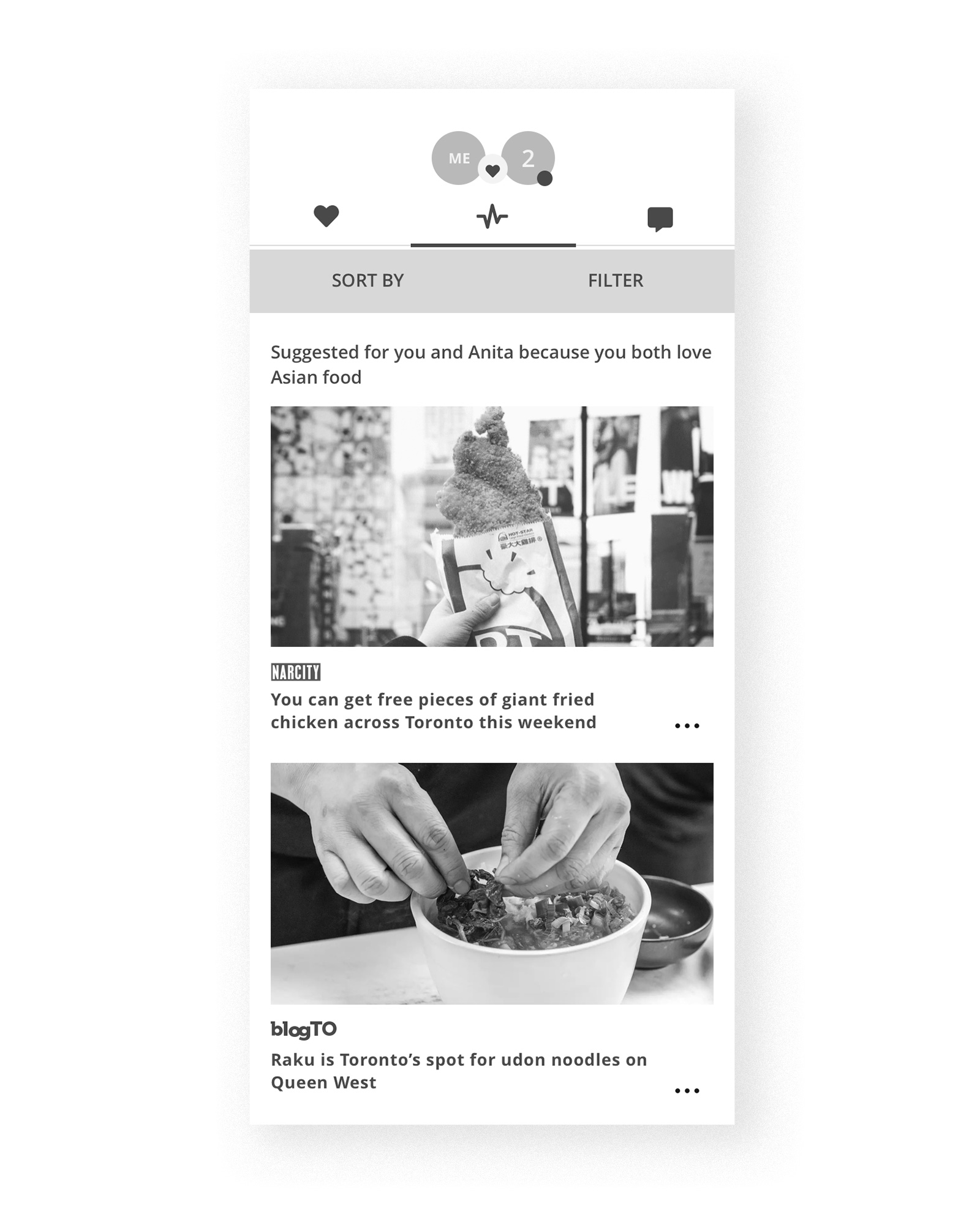
Prototype Version: For the first prototype, I decided to take away all the buttons and the ability for users to add to the feed to keep it simple
USABILITY TEST: 2 ROUNDS
Understand users and discover the best experience through iterations
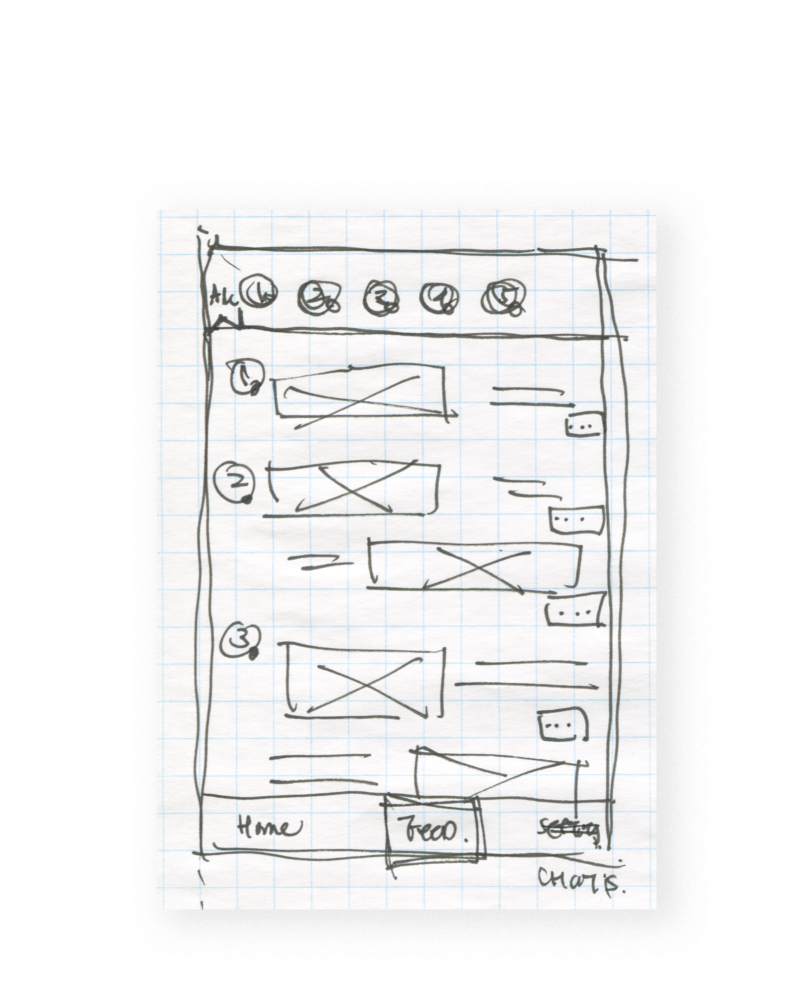
After going through the ideation process above for each screen, I created the first wireflow in mid-fidelity. This prototype underwent usability testing for two rounds with 5 participants in each round. Testers were given a set of 5 tasks to complete. The results from the first round of usability testing were used to inform my design changes for the next wireframe iteration.
NOTABLE CHANGES
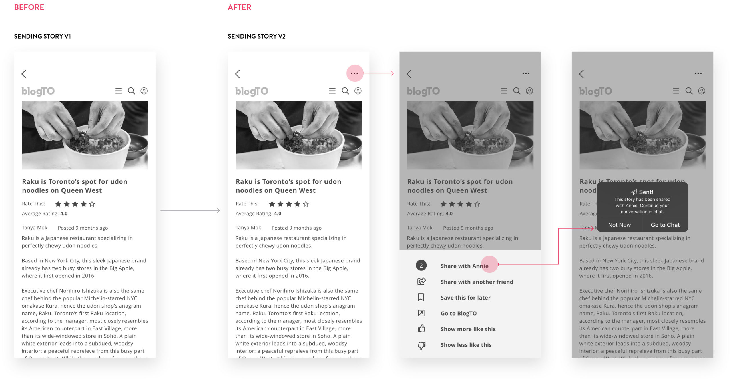
“I want to be able to share the BlogTO story from the page without having to go back to the main feed”
“I want to be able to share the BlogTO story from the page without having to go back to the main feed” — 4/5 testers
- 4/5 TESTERS
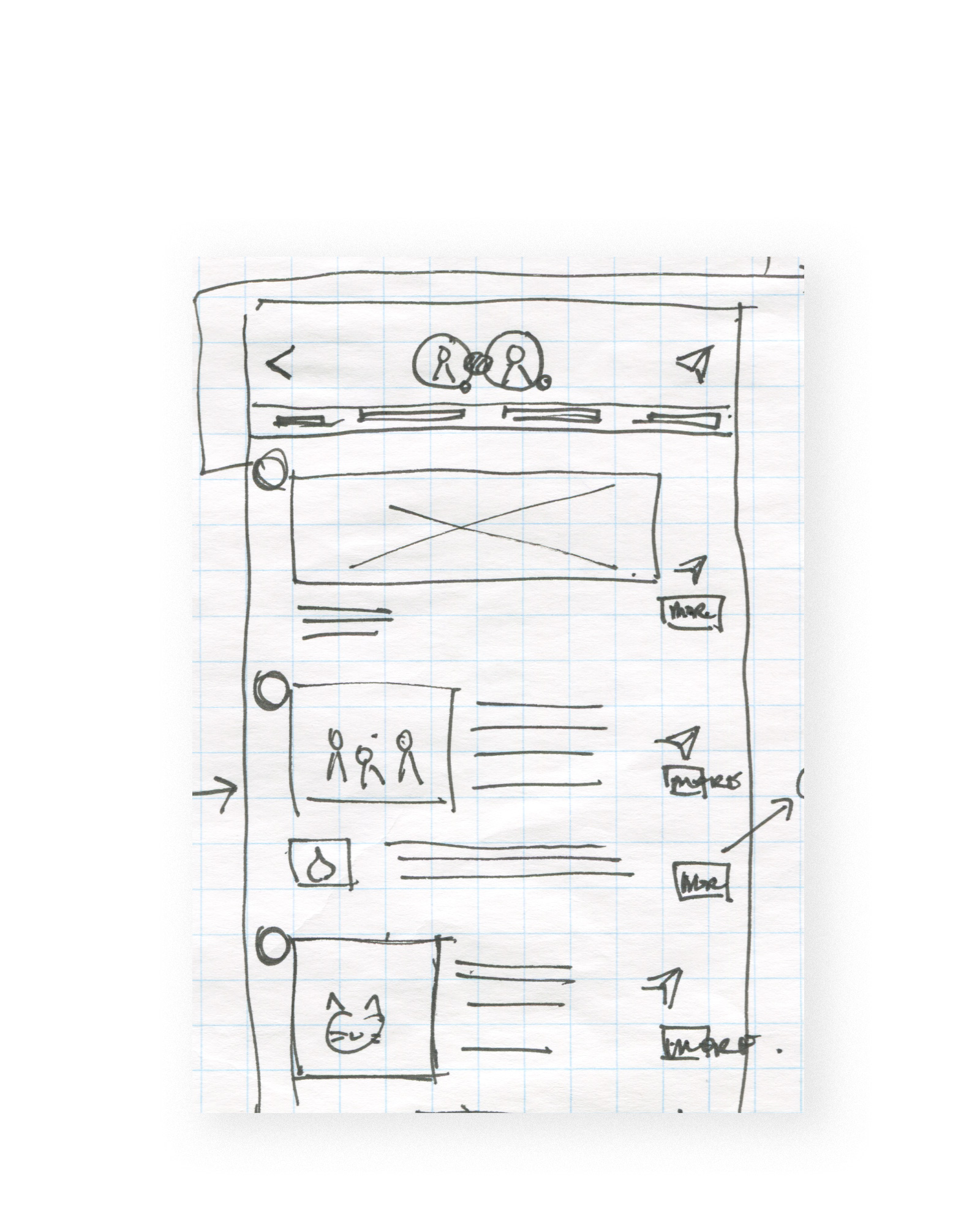
4 out of 5 testers expected a share button on this screen when they want to send a story to their friend. I added this function and additional screen so users don't have to go back to the feed to share a story.
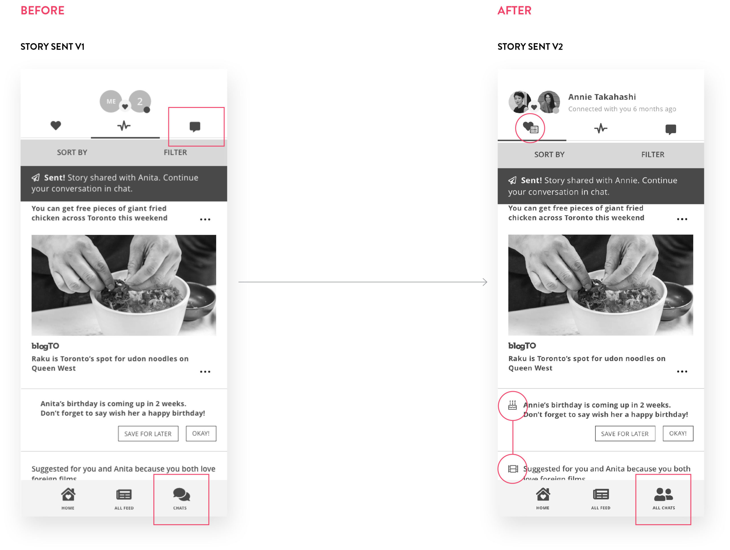
“I am confused. Why are there two chat buttons here? I can’t tell the difference and which one to press after the app tells me to ‘continue your conversation in chat’”
“I am confused. Why are there two chat buttons here? I can’t tell the difference and which one to press after the app tells me to ‘continue your conversation in chat’” — 3/5 testers
- 3/5 TESTERS
3 out of 5 testers were confused about which chat icon to press. I changed the icon on the bottom navigation and re-labeled to "all chats" to avoid the confusion with the icon on the top navigation. I also added icons in the feed to draw attention to why certain stories were being suggested.
From the feedback I received in testing Round 1, design changes were made to the prototype. I took the next iteration of wireframes to Round 2 of usability testing and continued to iterate.
Here is the final wireflow after two rounds of usability testing which was used to design in high-fidelity.
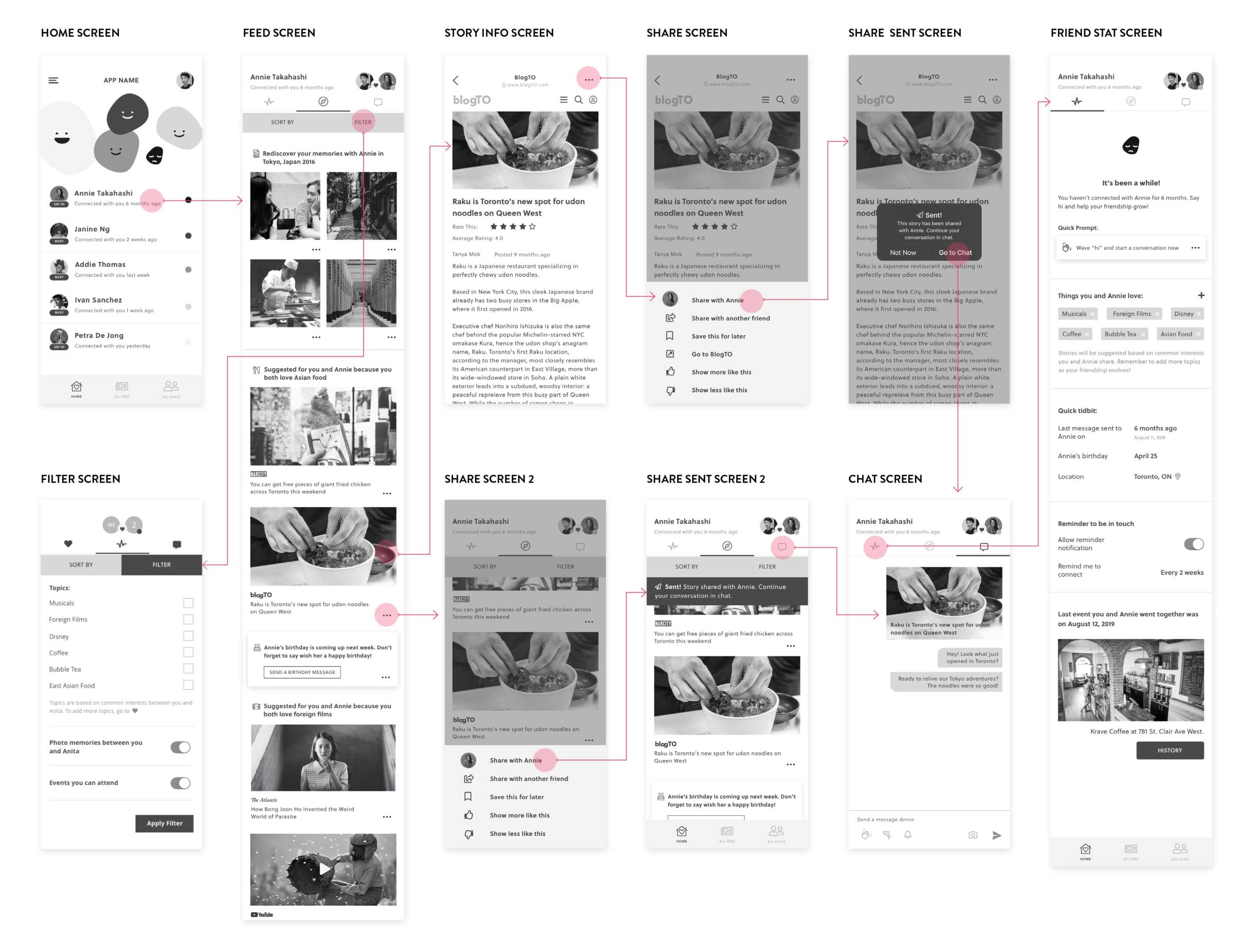
Final prototype version used to translate to high-fidelity.
COLOUR & TYPOGRAPHY
Enhance the experience and set the tone with a brand identity
With the final flow of screens established, I started thinking about the visual identity of the brand before creating the high-fidelity prototype. Here is the list of adjectives the brand embodies:
- Friendly
- Fun
- Cheerful
- Encouraging
- Simple
- Vibrant
- Enthusiastic
Using these adjectives, I searched for inspirations and created a colour palette which reflected these words. For typography, I used a font that evoked the same feeling, and was also legible at a small size.
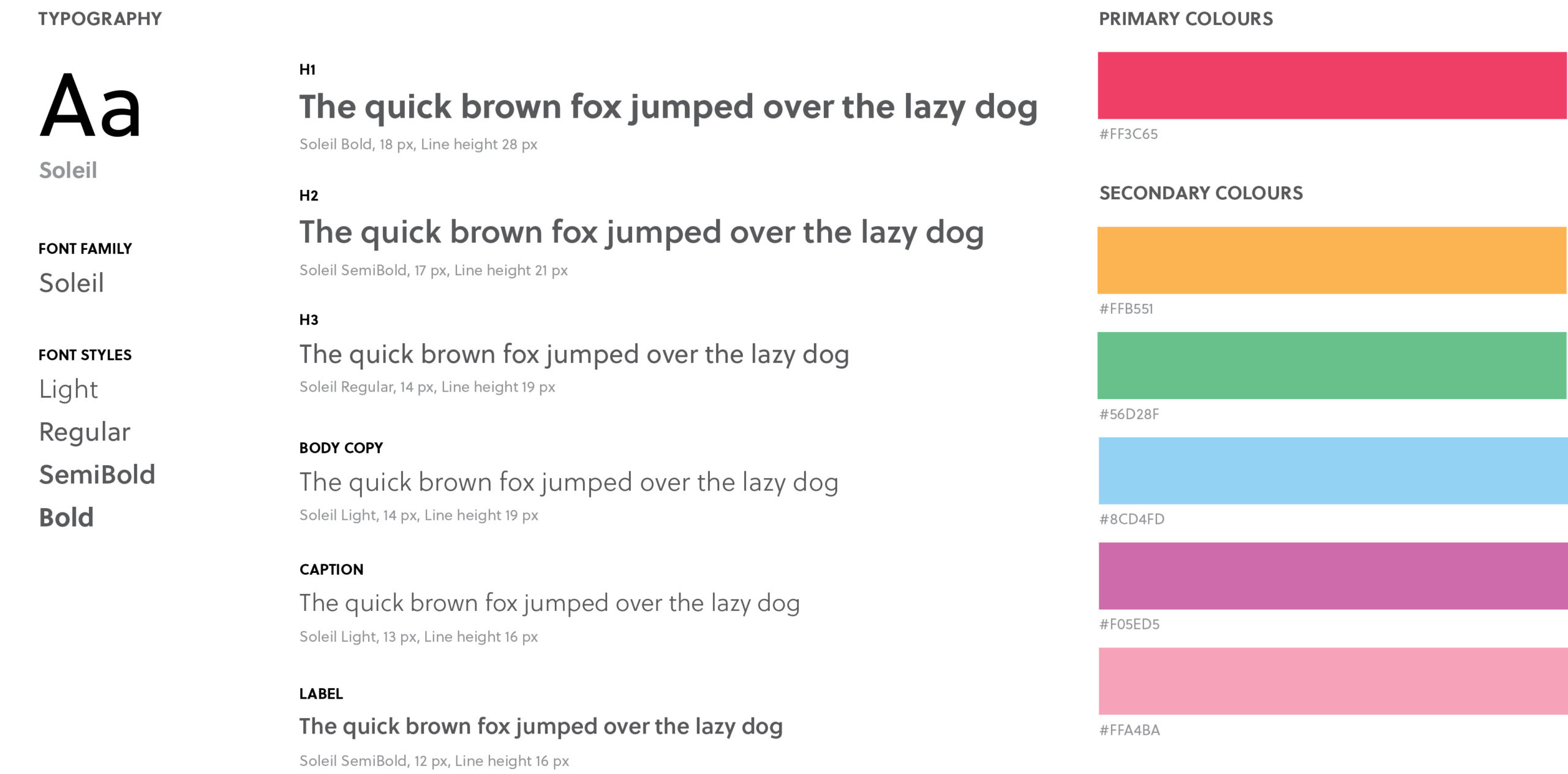
A look at typography and colours chosen for UI design
ICONOGRAPHY
No details too small
Knowing the visual identity was very colourful and the application design would have a feed with photographs, I needed to be careful with how I applied these colours. To make the UI feel colourful and fun but still put the main focus on the content, I decided to inject the colours in the icons in order to “dot” the screen with colours.
Final icon set. (Original icon source: Font Awesome)
LOGO DEVELOPMENT
How can a product be represented in a name?
For the app name, I explored words that were appropriate. The two finalists were “circle” and “loop”. Both embodied the idea of staying in touch and connecting with friends.
Through rough explorations, a final logo was developed for “loop”. To emphasize connection with friends, I incorporated an infinity symbol into the wordmark. I used a geometric sans serif font because the round counters of the Os echo the circle motif in the app.
Final logo development in colour, black, and white. And final app icon.
HOME SCREEN ITERATIONS
User interviews as inspiration for my design decisions
Before taking the prototype to the final high-fidelity, I explored different versions of the Home screen.
During user interviews, a quote resonated with me. Interviewees expressed that their friends were “out of sight, out of mind”. This inspired me to create a visualization that shows user’s friendship strength on the home screen. I experimented with different faces.
Ultimately, I decided to go with a simplistic face because of the high visual impact.
If time allowed, this screen would have benefited from further testing. Is there an alternative way to design this screen that would still have a high visual impact? This would be part of my future considerations.
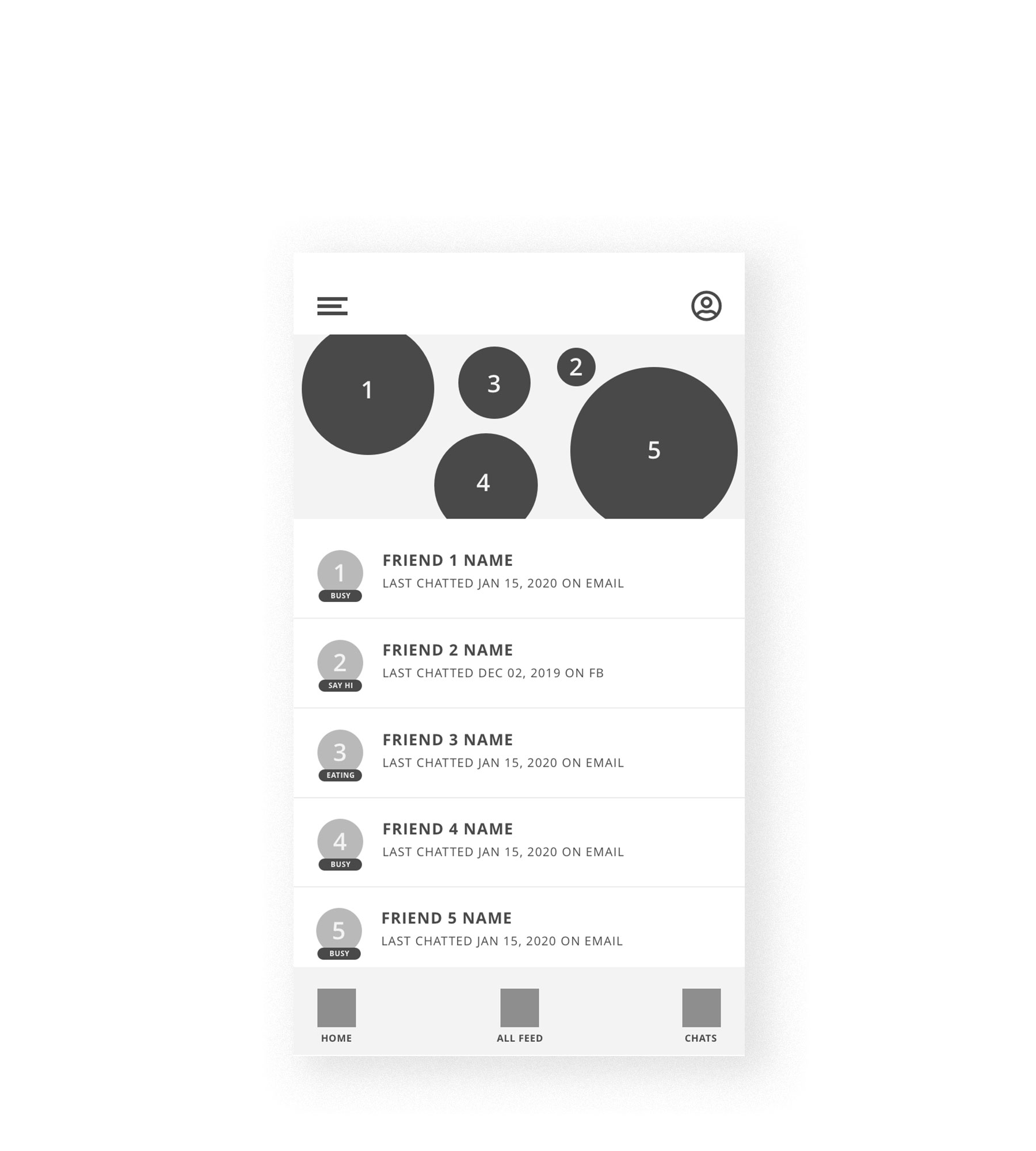
Low Fidelity: Quick mockup of home screen
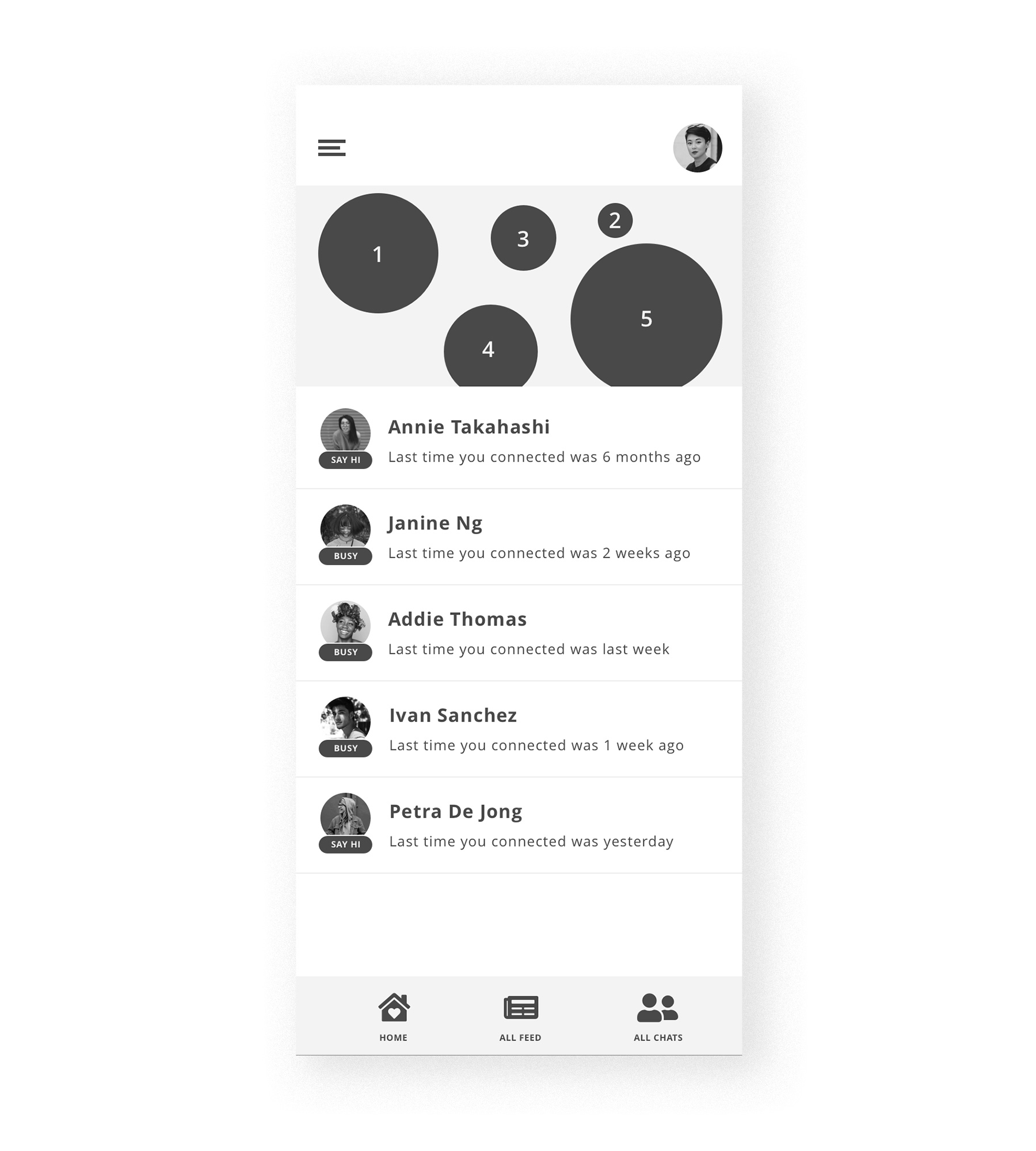
Mid-Fidelity: Version used for usability testing
Does a more stylistic face work for showing friendship status?

Perhaps a more simplistic face?
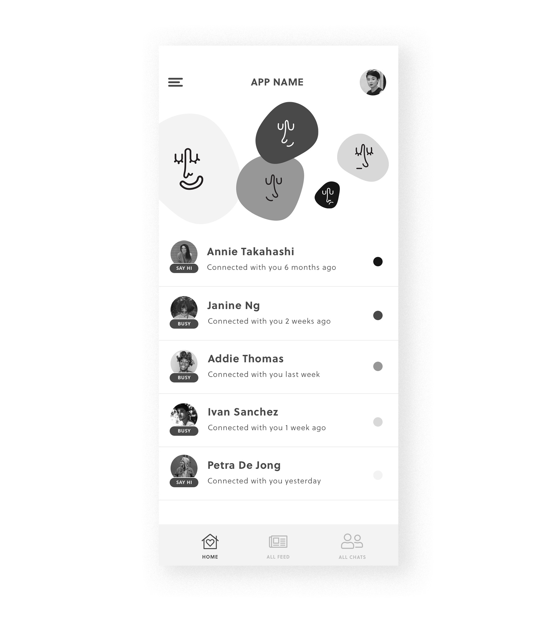
Final prototype: Refined with colours applied
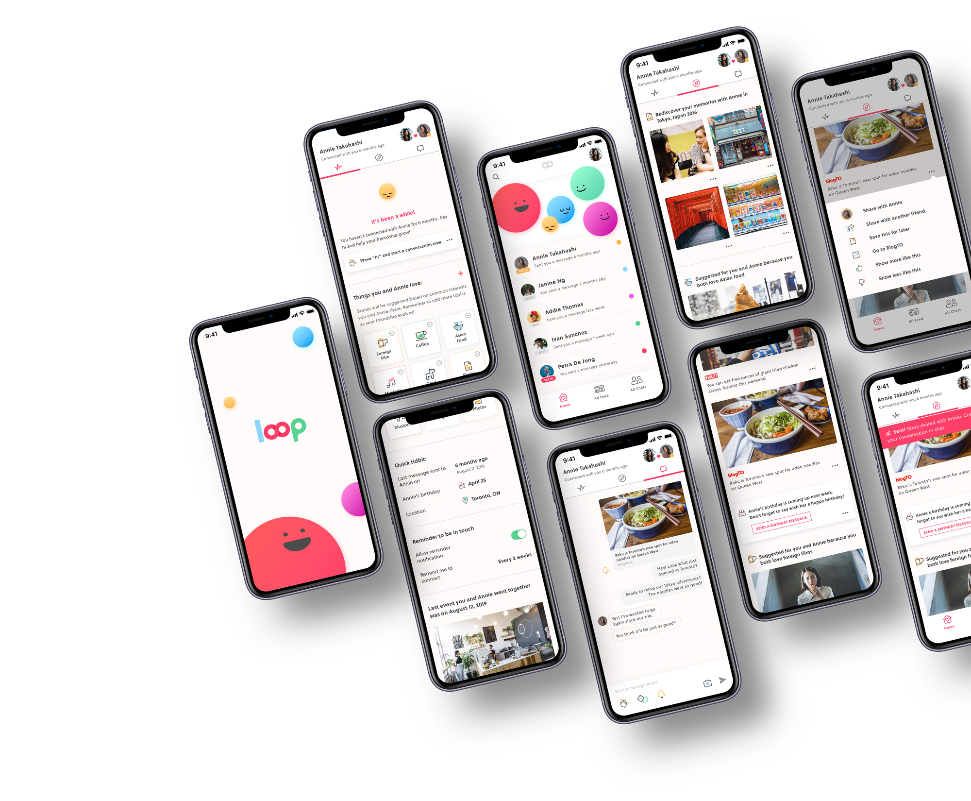
HIGH FIDELITY PROTOTYPE
Putting it all together
With all this in mind, and the Home screen fleshed out, I created my final UI design. If you're interested in the interactive prototype please click on the button below.
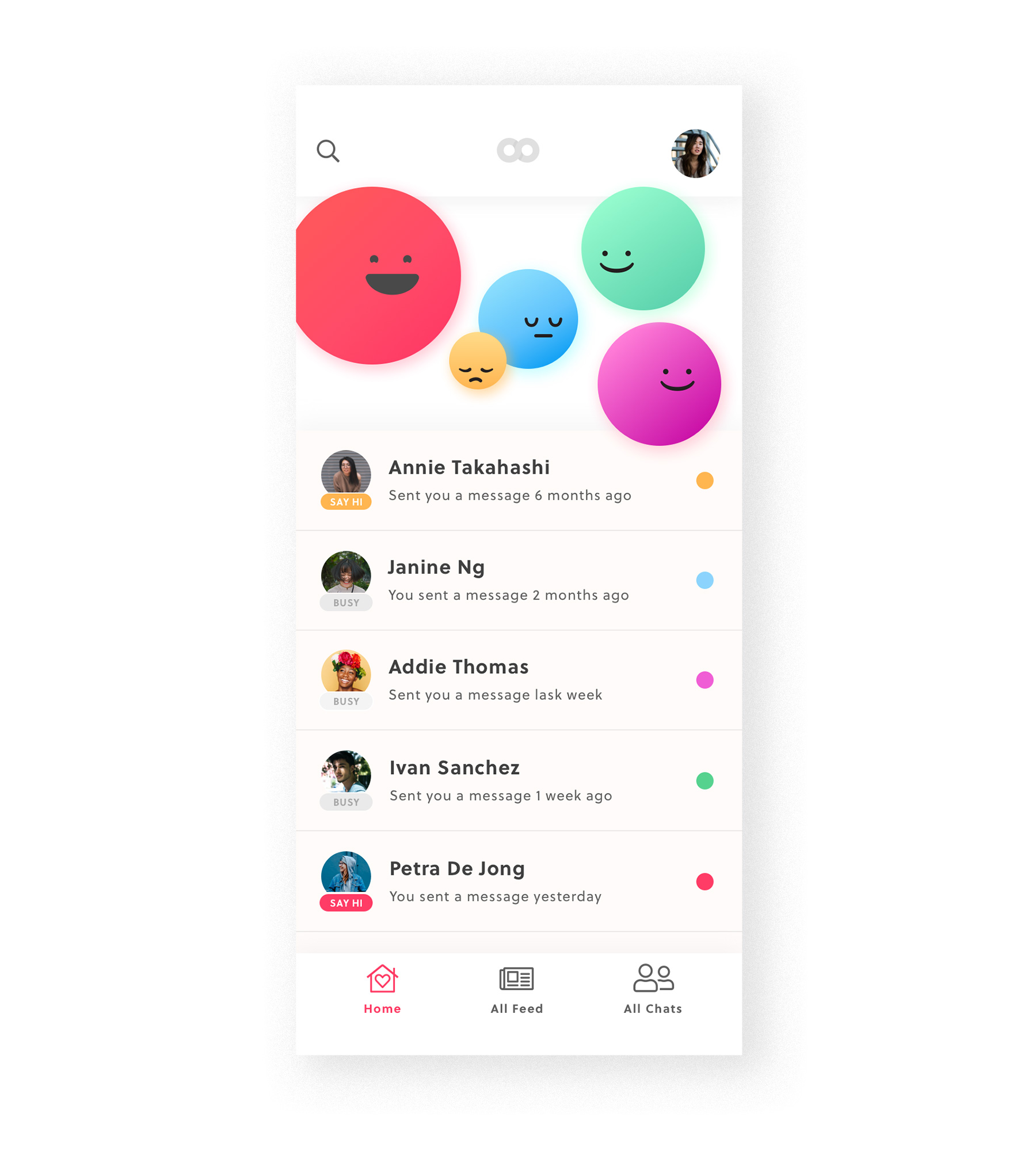
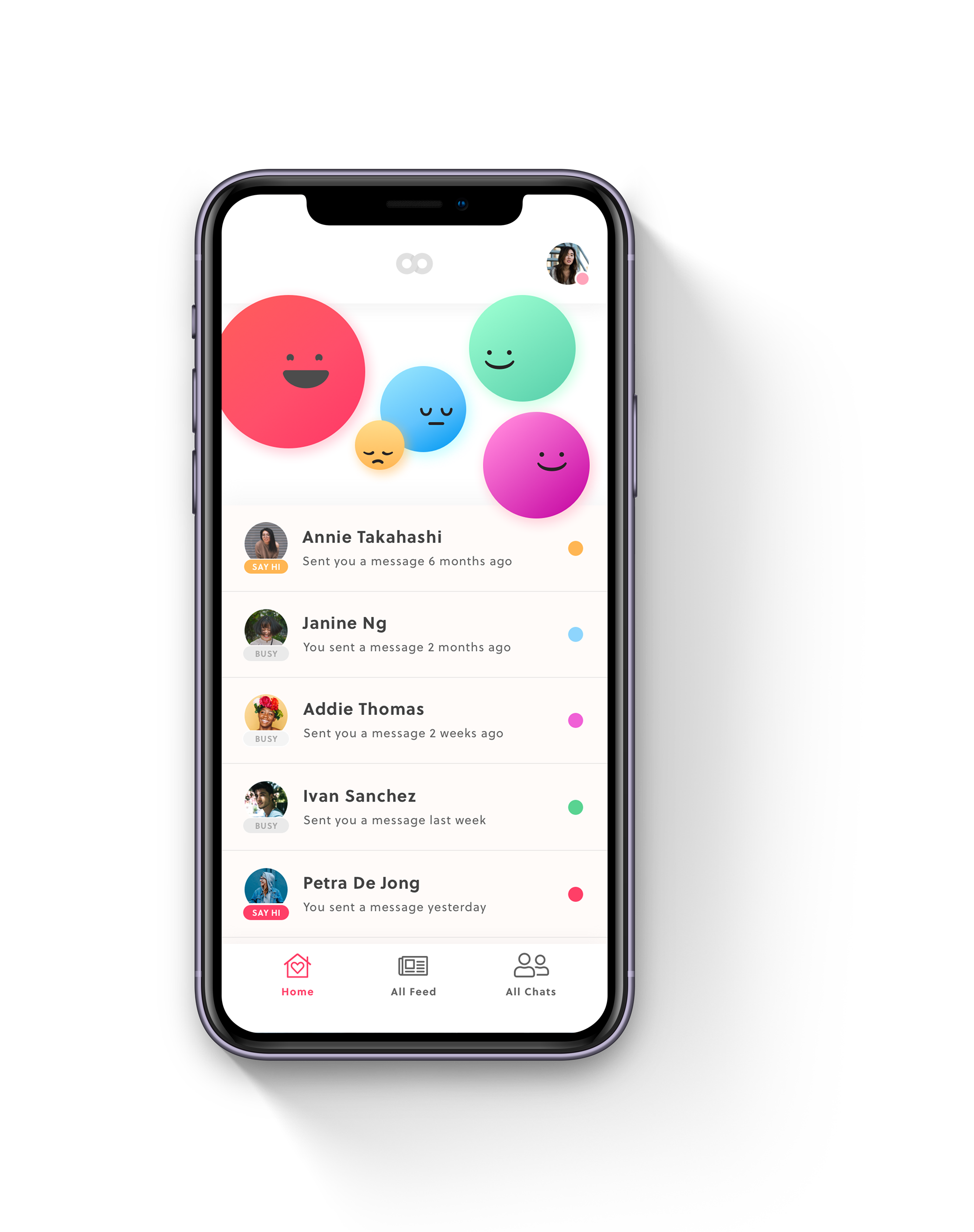
All your close friends in one place at a glance.
On the home screen, you can see your relationship strength with your closest friends based on the size of the coloured dot graphics. It’s easy to see which friend needs more attention in order to mitigate the awkwardness of long silences.
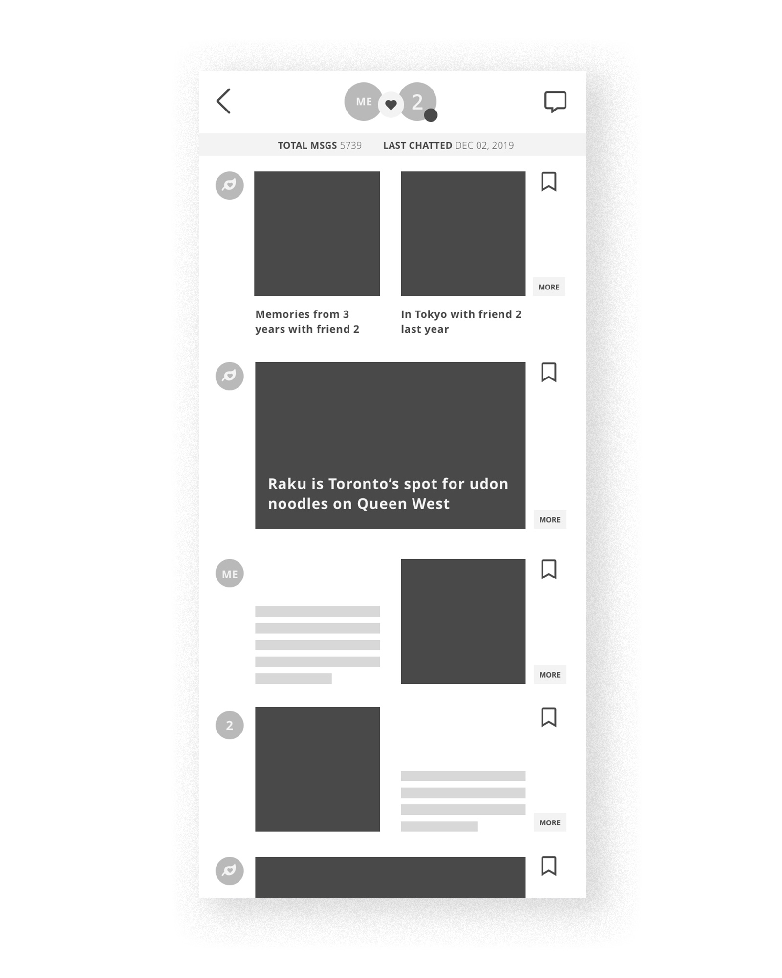
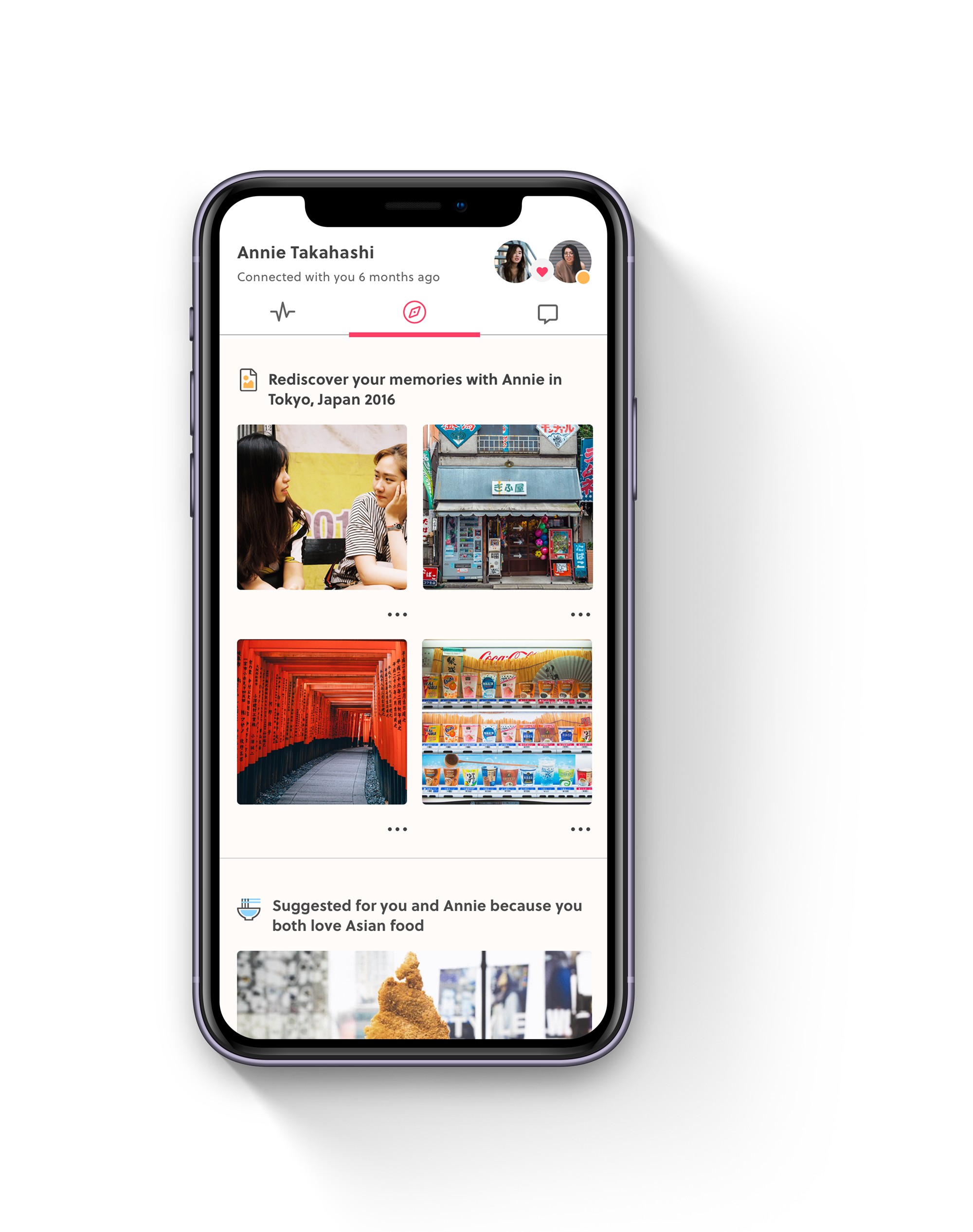
A feed for just you and your friend.
The explore page is dedicated to stories and memories between you and your friend. Reconnect by sharing these stories and spark a conversation regardless of how much time has passed.
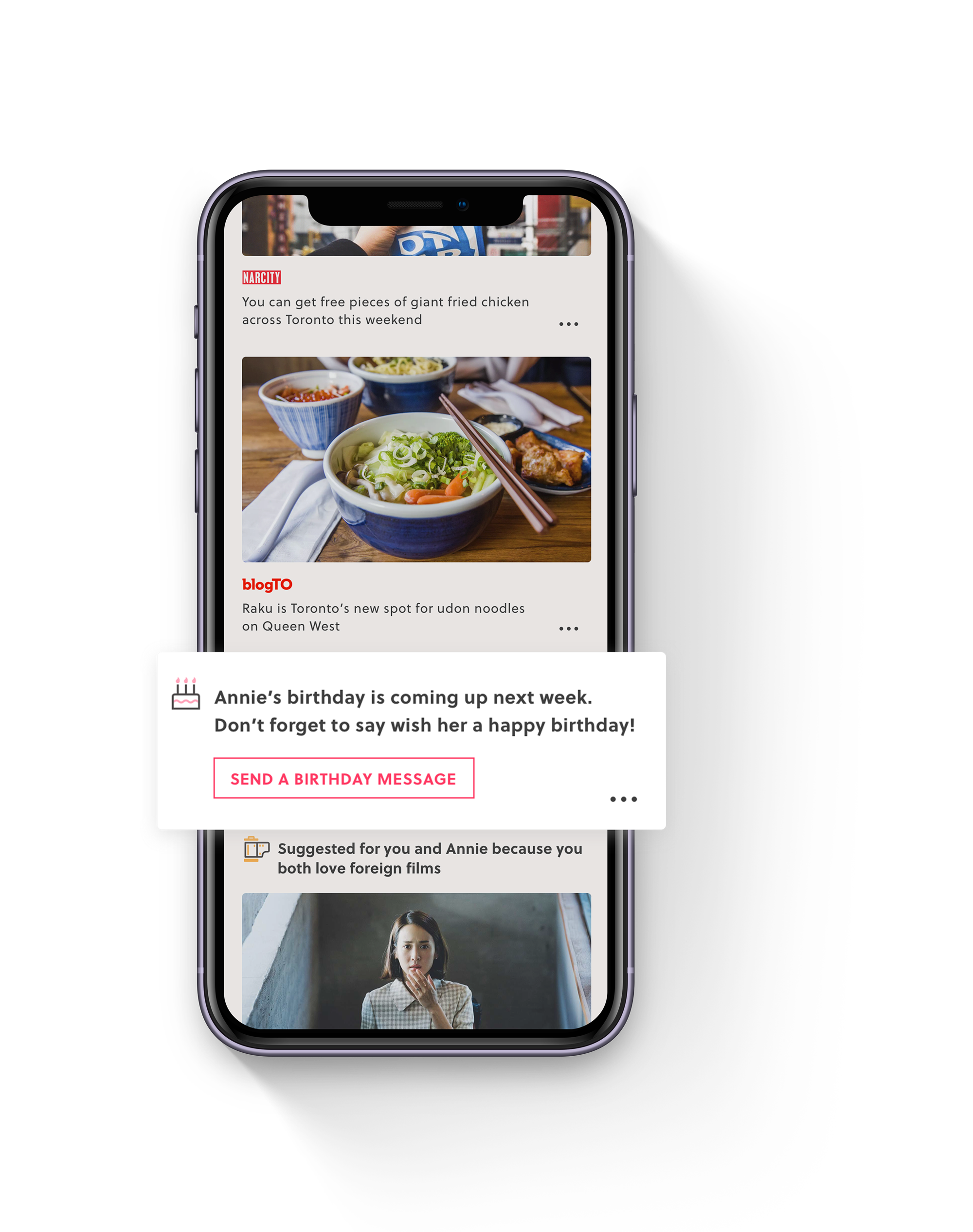
Quick Prompt
Prompt cards on the feed help with birthday reminders and quick hellos, so your friends know you are thinking of them even when time is limited.
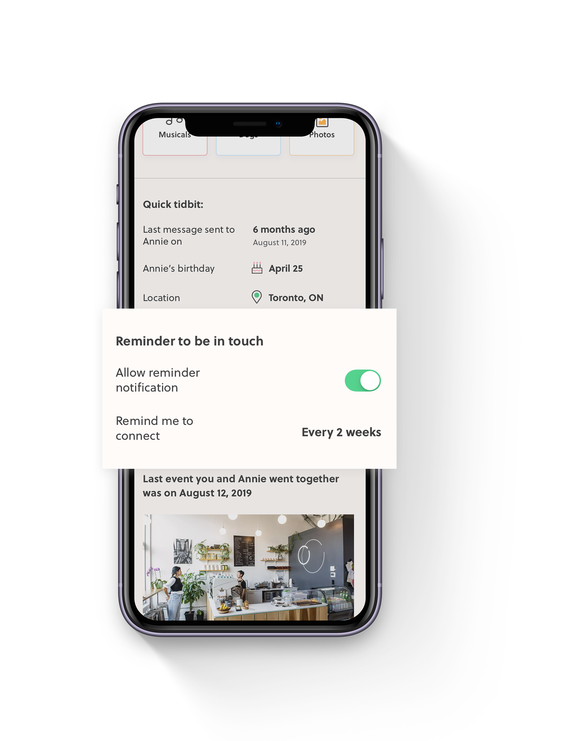
Never forget a friend
Create reminders to reach out to a friend as frequent as you want.
All your close friends in one place at a glance.
On the home screen, you can see your relationship strength with your closest friends based on the size of the coloured dot graphics. It’s easy to see which friend needs more attention in order to mitigate the awkwardness of long silences.
A feed for just you and your friend.
The explore page is dedicated to stories and memories between you and your friend. Reconnect by sharing these stories and spark a conversation regardless of how much time has passed.
Quick Prompt
Prompt cards on the feed help with birthday reminders and quick hellos, so your friends know you are thinking of them even when time is limited.
Never forget a friend
Create reminders to reach out to a friend as frequent as you want.
WHAT'S NEXT FOR LOOP?
A reflection on my design process and what to do for future improvements
Although there were many positive feedback after rounds of user testing, more improvements can still be made to this project:
- More testing and exploration for the Home screen visualization. Perhaps there is a more effective way to show a person’s friendship strength than graphic dots?
- What does the home screen look like if a person has more than 5 friends? Will this decrease the effectiveness of the visualization?
- Currently this solution shows a task flow between 2 friends in the same city. Future considerations need to be made for interaction between a friend group, or friends who are not in the same geographic location.
KEY PROJECT LEARNINGS
Learning to ask the right questions and keep testing
Looking at the work I accomplished during these 8 weeks, there were plenty of highs and lows. My biggest takeaway from the process of human-centered design is to let the users inform the design. If the design doesn’t improve user experience or meet a goal, then the design is just decorative. It is important to keep testing and keep iterating. And through this process, remember that as a designer, you are not your designs. I needed to keep an open mind during user testing and feedback, as there will always be hard moments which can lead to pivotal changes.
Other key learnings:
- Asking the right questions — I realized after conducting a few initial interviews that asking directed but open questions is important to validating my hypothesis. Without this, interviews end up with vague answers on irrelevant topics which do not answer my assumptions.
- Testing is a continuous process — which does not end after the user testing phase. As a designer, I am constantly balancing what is best for the user and other constraints, such as time and resource. When possible, continue testing because it will always lead to a better product.