
Context
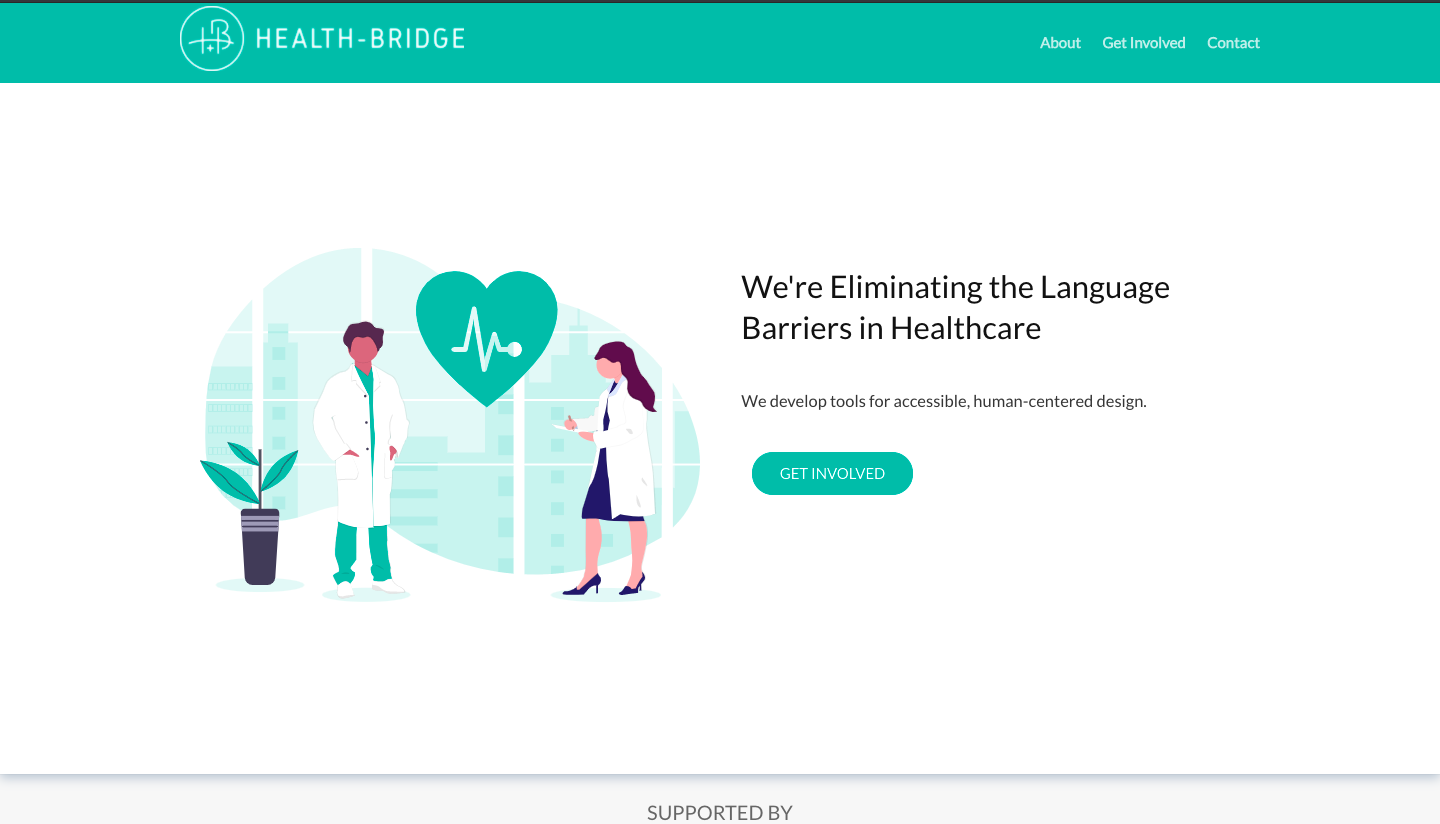
In the beginning of Fall, I joined a startup called Health-Bridge whose mission is to bridge language barriers between healthcare professionals and their patients. They recently launched their landing page and were beginning to prototype their MVP (minimum viable product) on Figma. Here’s their landing page:
Another designer, Adam, joined alongside me, but we quickly found out there were no design guidelines.
The Problem
I designed the initial mockup of the marketplace feature, while Adam took on the sign-up flow. However, we realized that it was almost impossible to maintain consistency in design across the UI without any design guidelines.
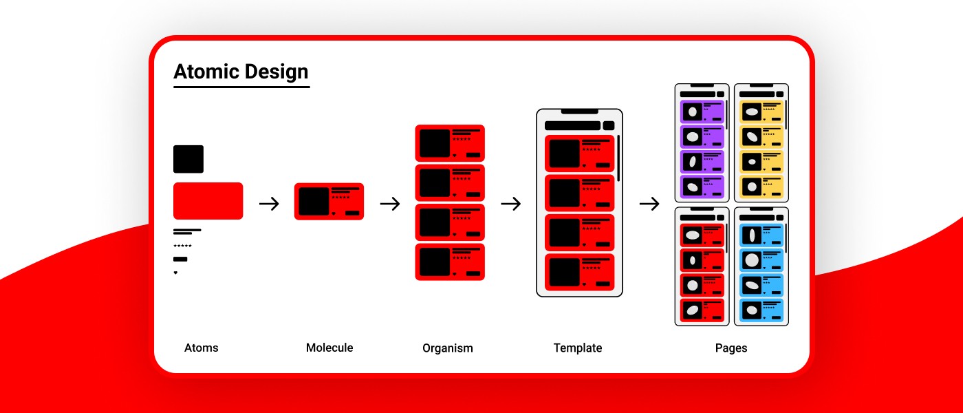
The Atomic Design Methodology
I took initiative and proposed to my team,
"Let's start a design system"
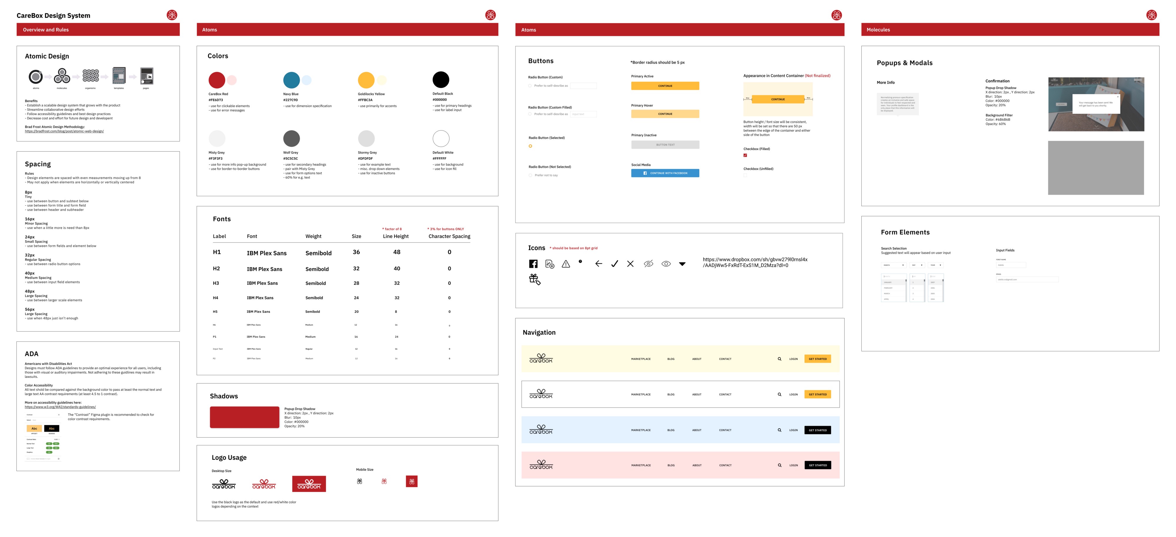
Luckily, I had previous exposure to a design system based off of Brad Frost’s atomic design methodology. This approach takes a nod to chemistry principles and breaks down the UI into atoms, molecules, organisms, templates, and pages:
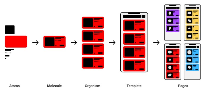
This methodology ensures a scalable design system that continues to grow alongside the product. It is also straightforward, allowing other team members to understand how the UI is deconstructed.
An Accessible Colour Palette
Using the atomic design approach as a guide, Adam and I started to compile elements from our designs into a separate Figma file (the start to our design system!) However, we first had to define a color palette that would:
Here is the approach I took:
- Gather potential color palettes from online purely based on aesthetics
- Present color palettes to the team
- Vote as a team to decide on a color palette most representative of our branding
- Derive similar colors that meet AA color contrast requirements from the chosen color palette
I took a deep dive at color accessibility, and learned how to check for the 4.5 to 1 color contrast ratio for the AA requirement (using a Figma plug-in called Contrast). I tested various color options by setting black text as the foreground and the subject color as the background.
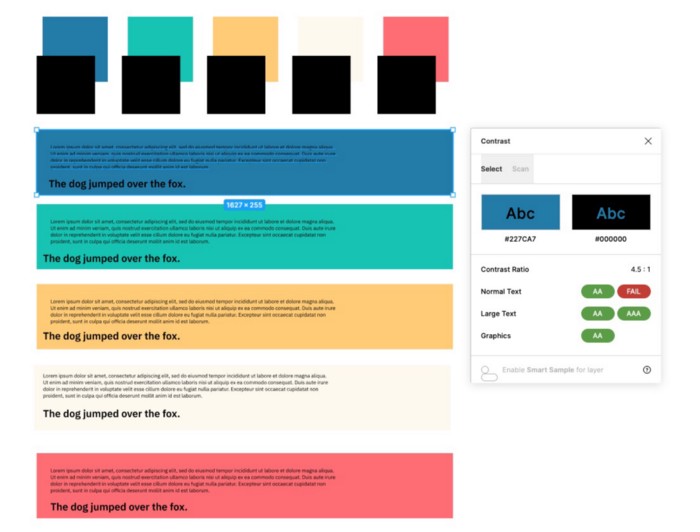
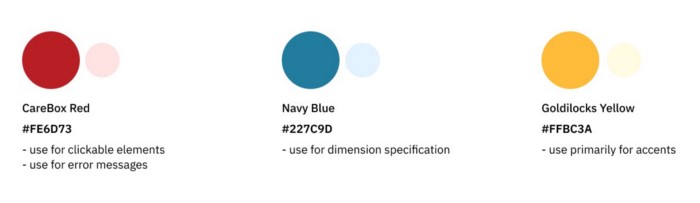
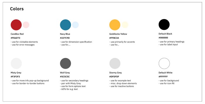
I established our primary colors as variants of red, blue, and yellow to meet our brand goals of “playful” and “fun.” Adam then specified the secondary colors by creating tints from the primary colors.
The next challenge was defining our grays. We identified all instances of gray in our existing designs, but a lot more variations of grays emerged than we anticipated. We successfully narrowed it down to 3 grays: light, dark, and medium. We figured 3 shades of gray would be the minimum number required to provide enough flexibility for the various situations gray would be used.
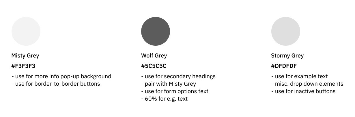
We made sure to list the use cases for each color according to the current state of the design file.
The 8pt Grid
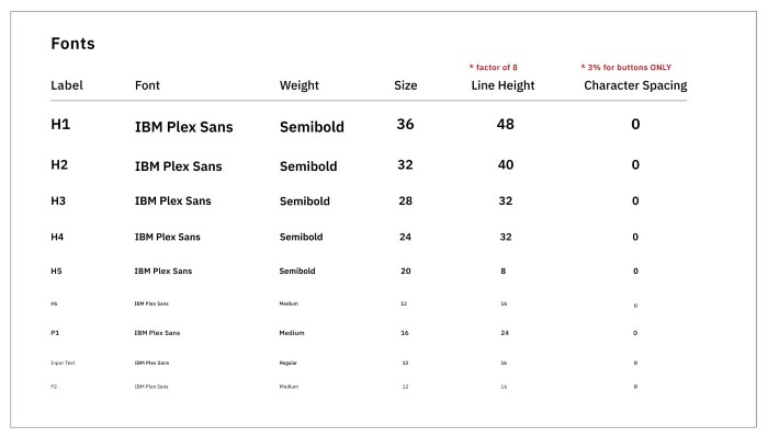
We thankfully had a predetermined typeface, IBM Plex Sans, so our next biggest challenge was deciphering the spacing guidelines.
Here’s how I approached it:
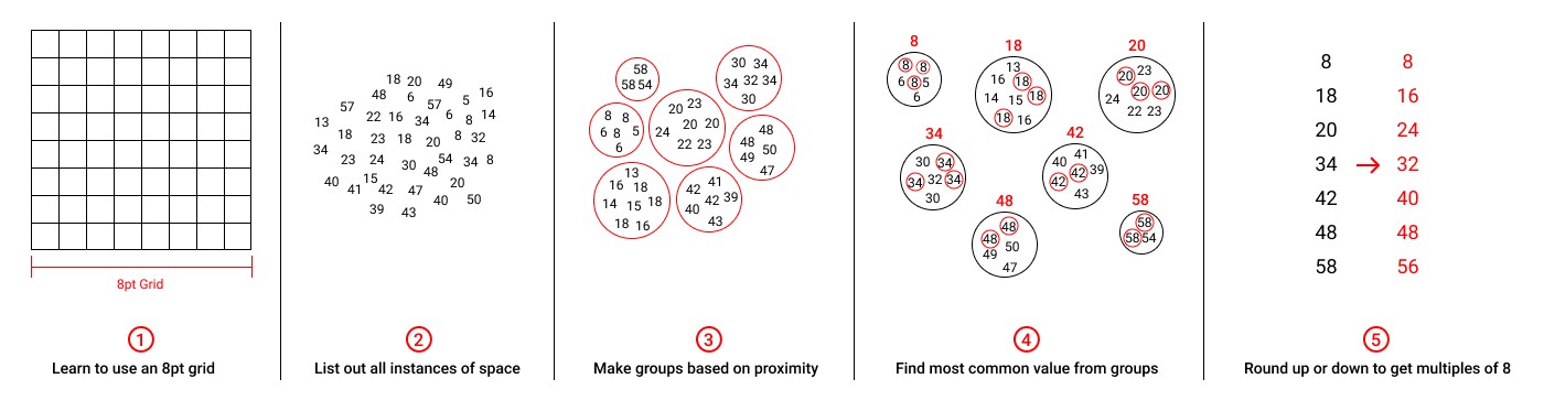
- Research best practices and find out that an 8pt grid was the most ideal
- List out all instances of spacing in the current design file
- Group spacing increments based on proximity
- Find the most common value from each group
- Take the common values and round up/down to make them multiples of 8
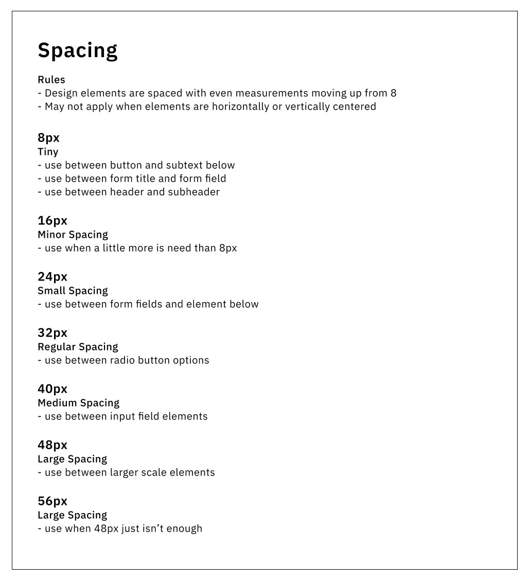
I followed the 8pt grid and specified the line height of the fonts, so that they would be multiples of 8 as well.
The Single Source of Truth
The rest of the design system came together as we pulled elements from our design file and categorized them under atoms and molecules.
Adam and I successfully established the initial design system to ensure future consistency and scalability in our designs.
As Audrey Hacq brilliantly mentioned,
"A Design System is the single source of truth which groups all the elements that will allow the teams to design, realize and develop a product."
The design system is currently being utilized by a team of designers and developers at Health-Bridge to guide their product development.
If I had the chance to redo the whole process, I would:
Starting a design system definitely sparked my interest in them, but I realized I have so much more to learn about their inner workings…